When Radical Femininity Becomes Just a Look
Marine Serre's new "love story" campaign

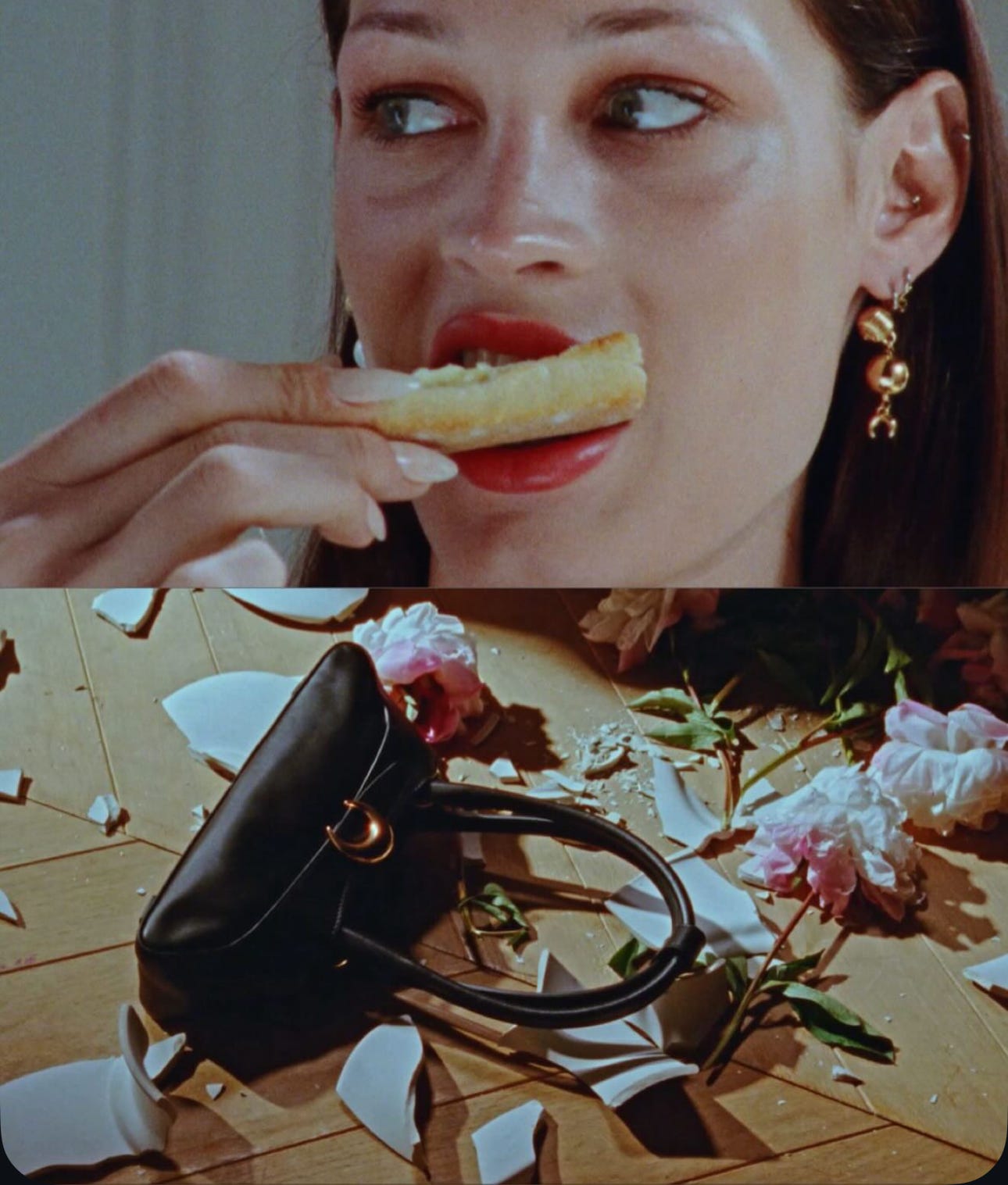
In Marine Serre’s latest campaign, a woman eats breakfast. A man enters the room, picks up a porcelain object, and smashes it. She doesn’t look up and doesn’t react.
This 30-second film has been described as “radical femininity” by the media. The brand itself frames it as “a love story where the woman holds the power.”

But what some people left wondering was: what’s radical about it? And where, exactly, is the female power within this context?
There’s something about a woman sitting in silence while something violent happens around her being romanticized by Marine Serre as if it was a wanna-be Pedro Almodóvar film that doesn’t sit well within the context. Her strength, supposedly, is in her calm. Her composure. Her lack of emotional response. This type of image isn’t new. It plays into a long-standing visual trope where femininity is reduced to a kind of “curated stillness”.
To understand these visuals, I remembered Lauren Elkin wrote in her book named ‘The Female Gaze’ (really recommend this read, by the way) about how women in visual culture are often shown as emotionally opaque, physically distant, and visually controlled. There’s a whole aesthetic built around that idea—what we might call aestheticized stoicism. It’s not about how women feel in an assigned context; it’s about how they look while appearing to feel nothing.
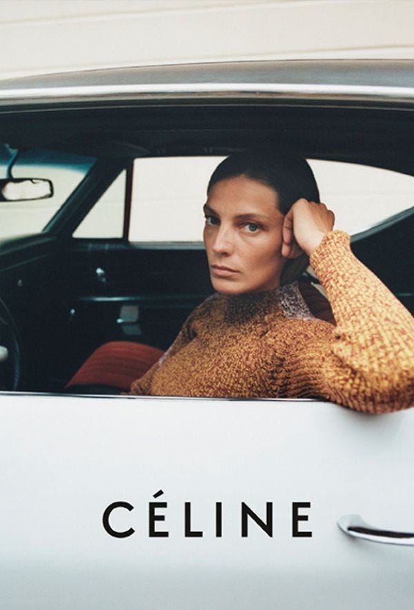
This aesthetic has been recycled way too many times, and it shows up all across fashion marketing. Phoebe Philo’s Céline is one of the clearest and most influential examples for this—images of women standing alone, serious, unreachable. It was celebrated for resisting objectification, but it also built a new kind of ideal: the composed, emotionless woman who is powerful because she reveals nothing.
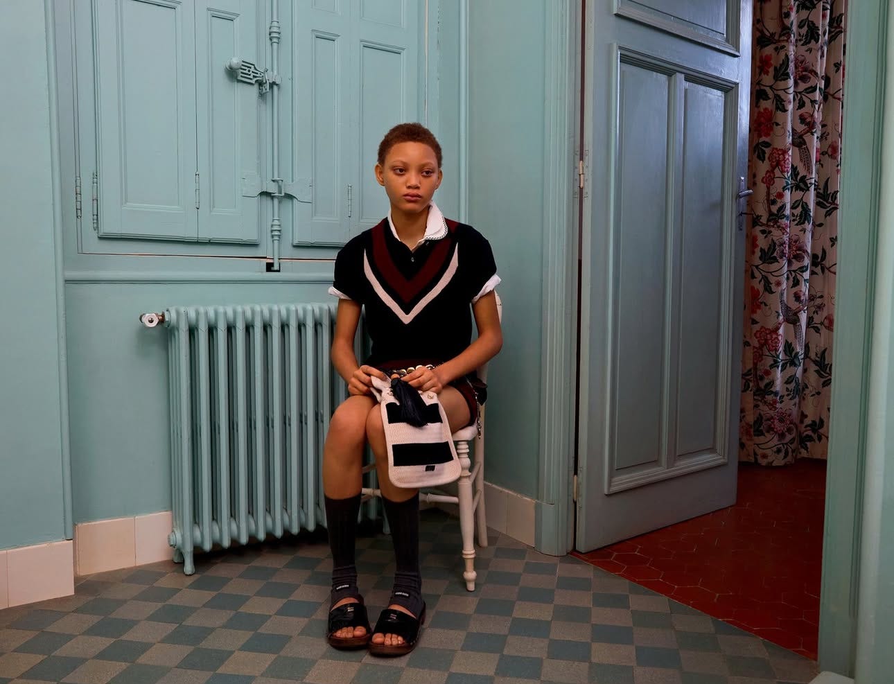
The Row does the same, in a quieter, more luxurious register of course. There’s grace in the restraint when expression is removed. The silhouette speaks instead of the body. Even Miu Miu campaigns often present young girls styled to look blank, passive, slightly melancholic (amazingly styled by Lotta Volkova). It becomes a whole vocabulary of detachment. A look we’ve learned to read as strength.
The problem is we call this visual aesthetic “radical femininity” because by being presented through this single, stylized mode, it stops being radical. It becomes a polished image—clean, composed, emotionally contained. This doesn’t mean stoicism isn’t ever powerful. Sometimes silence is strategic. Sometimes, not reacting is a form of control (or to piss off the other person as somebody in my video comments added).
But when the same image keeps showing up again and again as the default expression of feminine power, it says more about what the fashion industry is comfortable with than about the full spectrum of female experience.
Because the reality is that “real female radicality”—real power—rarely looks this still.
Women are not just elegant surfaces. We cry, rage, grieve, and we laugh. We’re contradictory. We show up messy, loud, delicate, soft, hard, and everything in between. The feminist experiences I’ve seen and lived are layered. They’re vulnerable. They’re angry. They hold you even while breaking down.
That’s why this campaign felt flat to me. Not because it’s ugly or badly made, but because it relies on an overused formula to say something that should feel more urgent, more embodied, more alive. Calling it “radical femininity” or “female power” only highlights how disconnected the term has become from actual, lived, radical female expression.
It’s easy to stage a woman who doesn’t flinch. It looks good in a 30-second film. But that’s not the same as showing a woman with power. And it’s definitely not the same as telling a story about love, either.
So the question I kept asking myself while analyzing this is: If this is what brands think radical femininity looks like, what are they afraid of showing?
Watch the recap video of my piece:
